In the digital realm, the website header and footer stand as the gatekeepers of user experience, holding the keys to engagement and navigation. Crafting these crucial elements with precision is akin to designing a seamless path for your visitors to traverse.
Join us on a journey through the art and science of optimizing the header and footer for unparalleled user satisfaction. Learn how these strategic placements can elevate your website’s performance and leave a lasting impression on every visitor. Welcome to the realm of perfect user-centered design!
Unleash Your Website’s Potential: Revamp Your Header and Footer!
The Role of Website Headers: Guiding Users to the Digital Doorway
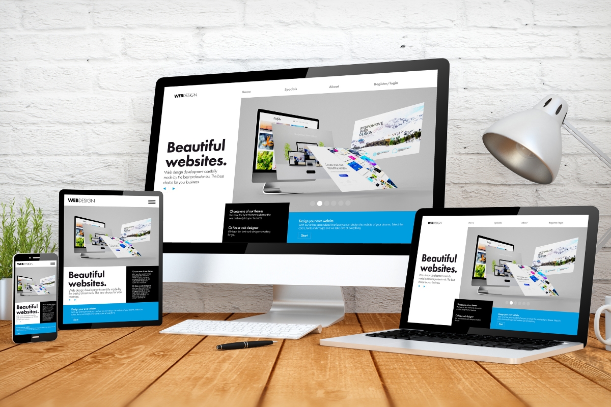
Website headers play a crucial role as virtual doorways, welcoming visitors and guiding them seamlessly through the online realm. They are the first point of contact for users and provide essential information and navigation options.
The primary purpose of a website header is to facilitate easy navigation and ensure visitors can find what they are looking for without confusion or frustration. By featuring clear and intuitive labeling, headers act as a roadmap, allowing users to quickly grasp the website’s structure and navigate to their desired sections or pages.
A well-designed and functional website header enhances the user journey by creating a seamless experience. It helps visitors effortlessly explore and engage with the content on your website. Understanding the delicate balance between design, navigation, and user expectations is essential in crafting a header that serves as a digital doorway to a remarkable user experience.
By focusing on providing actionable insights and practical tips, this article will equip marketers, business owners, and anyone interested in optimizing the customer journey with the knowledge to create effective website headers that guide users through their online experience. Let’s dive deeper into the world of website headers and unlock the path to an exceptional user experience.
Crafting a Captivating Website Header: Design Elements and Best Practices
Crafting a captivating website header requires a careful combination of design elements and adherence to best practices. By implementing these strategies, you can engage visitors right from the moment they arrive on your website.
First and foremost, consider the visual appeal of your header. A well-designed header should be visually striking yet aligned with your brand identity. Consistent branding elements such as logo placement, color scheme, and typography create a cohesive and professional look.
Another essential aspect is the inclusion of clear and concise navigation options. Limit menu items to the most important sections to avoid overwhelming users. Use descriptive labels that accurately reflect the content they lead to, facilitating intuitive navigation.
Consider incorporating interactive elements in your header, such as search bars or dropdown menus, to enhance user experience and save valuable screen real estate. Additionally, optimize your header for mobile devices to ensure seamless navigation across all devices.
Lastly, keep your header uncluttered and avoid excessive distractions. Too much information can overwhelm visitors, leading to a poor user experience. Strive for simplicity and prioritize the most important elements.
By following these design elements and best practices, you can craft a captivating website header that grabs attention, facilitates navigation, and sets the stage for an exceptional user experience.
Maximizing User Engagement Through Interactive Header Features
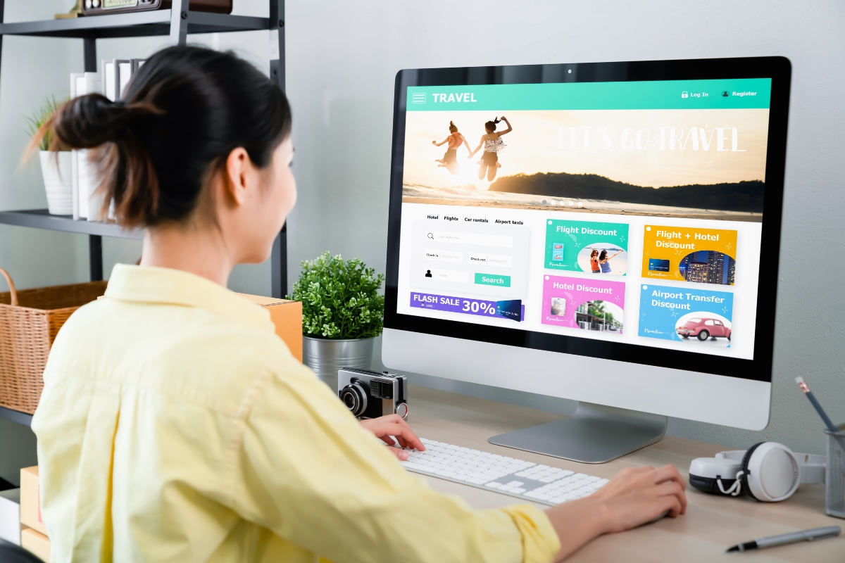
To truly captivate users and maximize engagement, incorporating interactive features into your website header is a powerful strategy. These elements not only draw attention but also encourage visitors to explore and interact with your website further.
One effective interactive feature to consider is a search bar. By providing a search function prominently in the header, users can quickly find what they’re looking for, boosting their satisfaction and reducing friction. Additionally, consider incorporating dropdown menus that offer additional options and subcategories, allowing users to dive deeper into your content effortlessly.
Another engaging approach is to include interactive buttons or icons that prompt specific actions. These can range from “Shop Now” buttons for e-commerce websites to social media icons that encourage users to follow or share your content.
Furthermore, integrating dynamic elements such as animations or carousels in your header can captivate users and create visual interest. However, be mindful not to overload your header with excessive animations that may hinder site performance.
Remember, the key is to strike a balance between interactivity and usability. Ensure that interactive features enhance the user experience and provide tangible value, rather than overwhelming or distracting visitors. By incorporating these interactive header features thoughtfully, you can effectively engage users and encourage them to explore your website further, leading to increased conversions and a positive overall user experience.
Website Footers: The Unsung Heroes of User Experience
Website footers may often go unnoticed, but they play a vital role in enhancing user experience and should not be overlooked. These unsung heroes provide valuable information and navigation options, allowing visitors to smoothly and effortlessly navigate and engage with your website.
One crucial element of a well-designed footer is providing essential links and contact information. This includes links to important pages like About Us, Contact Us, and Terms of Service, allowing users to find relevant information without searching extensively. By including contact details, such as email addresses or phone numbers, you enable users to easily reach out for inquiries or support.
Additionally, website footers present an opportunity to reinforce your brand identity. Consider incorporating your logo, tagline, or even a brief mission statement in the footer. This consistent branding helps users associate your website with your business and fosters trust and recognition.
Lastly, website footers can offer additional navigation options, such as secondary menus or social media links, enabling users to explore further and connect with your brand on various platforms.
By paying attention to these often overlooked elements, you can turn your website footer into an instrumental part of the user experience. Remember, the little details matter, and a well-designed and informative footer can leave a lasting impression on your visitors.
Designing Functional and Informative Footers: Elements and Essentials
Designing functional and informative footers is essential for creating a seamless user experience. These often neglected areas of a website can provide valuable information and navigation options that enhance visitor engagement and satisfaction.
One key element of an effective footer is the inclusion of important links. These can include secondary menus, allowing users to easily navigate to specific sections or pages. Additionally, consider incorporating links to frequently visited pages, such as FAQs, shipping and return policies, or customer support, ensuring that users can access crucial information without frustration.
Another essential component is social media integration. By including links to your various social media platforms, you encourage users to continue their engagement beyond your website, building a stronger online presence and fostering a sense of community.
Additionally, consider incorporating a subscription form in your footer. This gives users the opportunity to stay updated with your latest content, promotions, or product releases, enabling you to nurture leads and build a loyal customer base.
Remember, the key is to ensure that your footer is visually appealing, organized, and easy to navigate. By designing functional and informative footers, you provide users with a comprehensive and satisfying browsing experience, leaving a lasting impression and increasing the likelihood of return visits and conversions.
Navigational Excellence: Linking Strategies in Headers and Footers
Navigational excellence is a crucial aspect of website design, and linking strategies in headers and footers play a significant role in guiding users through the customer journey. By implementing effective linking strategies, you can optimize navigation, encourage exploration, and enhance overall user experience.
In headers, it is important to include clear and intuitive links to essential pages, such as the home page, product categories, or services offered. Using descriptive labels that accurately reflect the content they lead to ensures users can easily find what they are looking for.
Footers provide an opportunity to reinforce navigation options. Including secondary menus, related links, or a sitemap can help users discover additional content and navigate to specific sections. Social media links in the footer can also encourage users to connect with your brand across various platforms.
Applying these linking strategies not only improves user experience but also has SEO benefits. Internal linking between pages helps search engines understand the structure and hierarchy of your website, contributing to better indexing and ranking.
To excel at navigation, consider the example of Amazon’s website. They strategically place key product categories in the header and offer a comprehensive footer with links to various departments, policies, and customer service.
By implementing thoughtful linking strategies in headers and footers, you can create a seamless navigation experience that guides users intuitively, fosters exploration, and enhances overall customer satisfaction.
Mobile Optimization: Ensuring Seamless Experience Across Devices
In today’s mobile-centric world, optimizing your website for mobile devices is crucial to ensure a seamless user experience across devices. With the majority of internet users accessing websites through their smartphones or tablets, it’s essential to design and develop with mobile in mind.
Start by implementing a responsive design that automatically adapts to different screen sizes, ensuring your website looks great and functions properly on any device. This allows users to easily navigate and interact with your content, regardless of the device they’re using.
Focus on mobile-friendly features such as easy-to-tap buttons and streamlined navigation, optimizing the user experience for mobile users. Consider compressing images and minimizing the use of large files to reduce loading times on slower mobile networks.
Testing is key to ensure your mobile optimization efforts are effective and delivering the desired results. Regularly test your website on different mobile devices and screen sizes, checking for any issues or inconsistencies that may arise.
By prioritizing mobile optimization, you create a seamless experience that captivates and engages users, regardless of the device they choose to access your website.
Conclusion: Orchestrating Harmonious Website Experiences through Headers and Footers
Headers and footers play a crucial role in enhancing website experiences. By designing functional and informative headers and footers, you can orchestrate a harmonious browsing journey that captivates and engages users. Remember to prioritize mobile optimization and effective linking strategies, providing users with a seamless experience across devices.
Ready to elevate your website to the next level? Contact Newman Web Solutions at (404) 301-9189 or schedule a 30-minute free marketing strategy session and discover how our expert web design services can take your brand to the next level and help you meet your business goals.


